Samsung Galaxy SII (GT-I9100) - Review
Table of Contents
After about three weeks I feel ready to write this late review on the Samsung Galaxy SII, an Android best seller. I have been using it, switched back to my Acer Stream (2010 gen.), compared it to the Pre Plus and the old and dusty T-Mobile G1 to come to the conclusions I will share now. The Galaxy SII in question was running Android 2.3.3, build Gingerbread.XWKE2.
The first thing one notices when one gets the SGSII is: “Wow, that IS a small box.” The next is, after opening the box: “The box couldn't be smaller.” One takes it out and thinks: “Hey, that is thin and light”. A second later one notices, that the battery isn't inside the phone yet - I could go on like this, but who would read it like that.
HARDWARE
It's thin (8.49mm), but huge - and light (119g). It's fast, a 1.2GHz Dual Core ARM Cortex A9 chipset, accompanied by ARM Mali 400 MP graphics (developed and made by Samsung, called Exynos 4210) and 1GB of RAM provide a stutter free Android experience on a WVGA (800x480) Super AMOLED Plus screen (12 subpixels. 16GB of onboard storage (microSD slot is there, too), an 8 Megapixel Camera with LED flash, a 2MP front camera and a HSPA+ capable 3G module make the spec sheet complete.
While the device feels good and solid in my rather large hands (at first I found it a little bit to light and was terribly afraid of breaking it), the hardware has its weaknesses - I don't want to comment on the plastic skin of the device, which makes it so super light and feels sturdy, but on the button of the SGSII, which are.. well, not that great.
First of all, there is the missing camera button. Not that I would particularly like dedicated camera buttons, but with such a good and quickly starting camera like the one of the Samsung Galaxy SII, this IS annoying, as starting the camera becomes more interesting, as you know that you could do a quick shot if only there was a dedicated button (or maybe a lockscreen option, though that would be slightly inferior in my opinion) to start the camera. But there is none, and so you find yourself searching hectically for that camera shortcut - I placed one on every homescreen, but that's an ugly hack.
The three buttons the SGSII has on it the sides, volume up and down and power, are, to make this button game even worse, poorly placed, on opposite sides at the same height. This made me hating them, as I, while short pressing the power button to save power by switching the screen off, often accidentally raised the volume without noticing. Think of sitting in a business meeting (or a lecture at school or university, or in a play at the theatre) and your phone starts ringing loudly - it didn't happen to me, but that was because I was lucky. I believe that Samsung should have placed both buttons on one side or moved the power button to where the iPhone has its - if technically feasible, they should do that for their next superphone, even if that means an extra millimeter of thickness.
These are the most annoying buttons, and I've got to say that the one physical, surrounded by two capacative ones, sitting right under the screen, aren't that great, too. As Samsung seems to be trying to resemble the iPhone as good as possible, they didn't watch usability here. While there is nothing to complain about the physical Home Button, the other two (you can configure their illumination in the settings, which is a nice touch) are so close to the bright and amazingly colorful screen (I didn't miss qHD resolution, though more is always better ;) ), without anything that makes a haptic difference and at a low height of 14 millimeters, that it occurs that you touch them while trying to access the buttons of an application or the other way round - especially while you're in a haste.
One more thing: There is no notification LED on the SGSII.
Nonetheless, all these issues are negligible, the Galaxy SII is a great hardware, that looks awesome (while sort of knock-offy), sometimes at expense of usability.
SOFTWARE
 |
| TouchWiz 4.0, slightly customized |
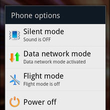
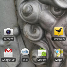
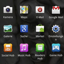
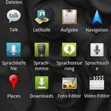
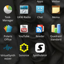
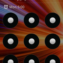
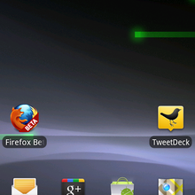
The Android 2.3.3 software (as reviewed, I will update to 2.3.4 right after this review, unfortunately not OTA) doesn't come stock but has a layer on top of it, that is custom to Samsung devices and has the name TouchWiz, iteration 4.0. With 4 buttons at the bottom it resembles a well known fruit phone. Besides that, Samsung has replaced many icons, and added in blue as an additional color.
While speed and responsibility aren't harmed by TouchWiz (which is a notable thing, as other custom layers, like the ones of LG, Motorola (Motoblur), Sony Ericsson, and HTC (Sense) have been reported to slow the phones down - to there defense I have to add that the customization's of the latter two change a lot more), my eyes and usability are.
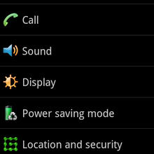
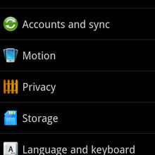
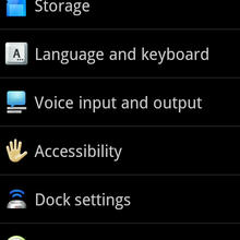
It's a personal thing, but I find these TouchWiz icons ugly in comparison to what Android 2.3.x (Gingerbread) delivers. While the colored buttons in the settings menu may help some, the changed battery icon definitely doesn't - it's always green, while the stock icon features different colors that help illustrating the battery status.
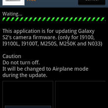
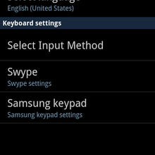
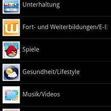
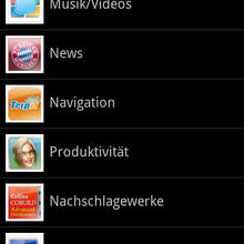
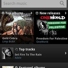
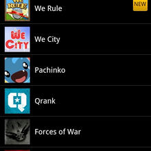
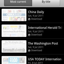
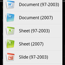
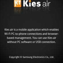
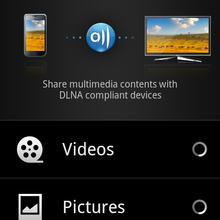
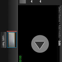
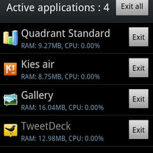
Samsung has added some applications in, as all manufacturers seem unable to resist to (this, BTW, is a great pro of the Nexus series). Most prominently these are the 4 Hubs (Social Hub, Gaming Hub, Readers Hub and Music Hub), that offer you content for money - even the Social Hub, which just comes with a limited feature set. All of these hubs seem to be an attempt to build an ecosystem like the one Apple offers - but it's no more than an attempt in my opinion. In addition to this, there is “Samsung Apps”, an application market which offers you a bunch of free Apps, among these many, that are in the Android Market anyway (which is still crowded and appears sort of unorganized). It has some special Samsung applications in the “Utilities” section, which are quite usable though (many of these come preinstalled, but not all), including Kies Air (which is great, you connect your Phone to your PC via WiFi and can access the phones data via your PCs browser), Samsung Remote, Samsung Mobile Print and a tool which you can use to update your phones camera firmware. The most welcomed additions by Samsung to Android (they have added in a custom email app (somehow connected to that Social Hub crapware, customized dialer, contacts, calendar in a million small ways that don't add value in my humble opinion) are 3 three preinstalled apps: A Video editor, a picture editor and Polaris Office, which allows to view and edit Microsoft Office documents (+ view PDF). While all of these apps surely have a limited feature set (this is mobile!), they come in nice and handy and one is glad to have them. Swype is a nice addition that deserves to be mentioned, too.
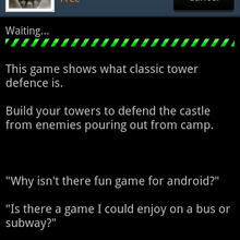
A friend of mine just bought a SGSII (as his first real smartphone), and I want to share his first impression with Samsungs Software stuff (translated):
“I’ve now bought the SII 9100: D and I’m still happy ….. I wonder just how much garbage is already on the homescreens - mega lots of windows for gaming hub, movie hub, … etc - if you use them, does that cost money? Are these applications where one has to download stuff et cetera or where you are directed into a store?”
Sounds like fail, Samsung!
USABILITY/MULTITASKING (Software side)
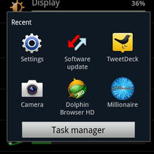
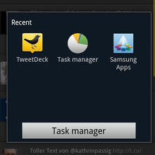
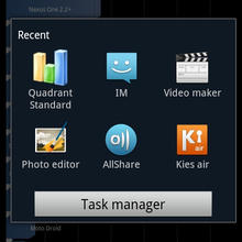
Well, this is Android. Usability on Android has never been exactly award winning, and Samsung didn't manage to really improve this with TouchWiz 4.0, which makes the whole TouchWiz story even more disappointing. Multitasking on Android means using a “Share” option (when you want to send something to another App) or using the Home Button with a short or a long press. While short press brings you back to the homescreen where you left of (another press then directs you to the first homescreen in TouchWiz (as opposed to the one in the middle on stock Android), a long press on the SGSII's home button leads you to a Screen showing the “Recently used Applications”. This seems nice, but say you've got a notification (new email) and entered your email app using the Notification area (which Samsung enhanced nicely, though CM does this in a better way), you won't find that email app among the recent apps that pop up after another long press after you've gone elsewhere (e.g. browser, to look things up). Google should really improve this in Ice Cream Sandwich, the next Android release which is going to unite smartphone (Gingerbread, 2.3.) and tablet (Honeycomb 3.) branches of Android again. And then there's this Menu Button, which, mostly because of bad usability decisions by App developers is a pain in the neck - comparable platforms like iOS or WP7 don't have such a button, which shows that it isn't necessary - in fact this button is a relic of the early days when Android was developed to become a Blackberry competitor using Googles services. None of these things are genuinely Samsung's fault though, it's a problem of Android itself.
PERFORMANCE
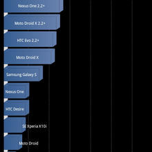
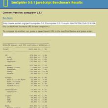
Nothing to complain here. It's fast, it's fluid - I experienced crashes using 3rd party applications, but that's most likely not Samsungs fault. It's on a speed experience level with the latest fruit phone. However, for those of you into gaming, you may consider to get a nVidia Tegra2 powered device (such as the LG P990 or the Motorola Atrix, which both have more flaws then the SGSII), as these feature the Tegra Zone with special games - what Samsung offers in their “Samsung Apps” can't compete yet.
BATTERY LIFE
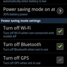
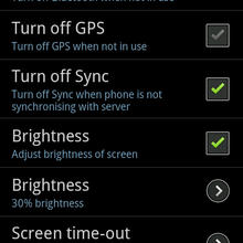
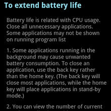
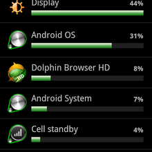
Well, it's OK. It worked a day for me usually, and I am pretty hard on my phones - the SGS II did better than the Palm Pre Plus or the Acer Stream. I could criticize some of the Power Saving Mode stuff Samsung did (no revert to 2G, etc. pp.), but at least they tried to help users with power saving. What's annoying: Once battery drops under 10%, you can't take anymore pictures. Doesn't make sense to me.
ACCESSORIES
Samsung doesn't put much into the small box. Among a wall charger and an USB cable and an everlasting Quick Manual, all you find is a surprisingly good in ear headset, which really sounds good. I am going to get myself one of these for my Palm Pre Plus as it just is a lot better (though not as good in the looks department - but, as you know, beauty is in the eye of the beholder).
VERDICT
The Galaxy SII is a good phone, that offers great performance. Samsung really did a good job with the Exynos chipset - unfortunately the phone doesn't deserve the title “great” due to aforementioned issues. Many of the issues, mostly those on the software side are fixable - if they aren't fixed by Samsung, the community will attempt to do so.
+ / Pro
- huge, great, responsive, colorful Super AMOLED + touchscreen
- thin
- Camera
- fast. really fast!
- battery life is really ok for such a beast
- / Contra
- TouchWiz / Samsung Software additions don't add much
- no Camera button, overall button placement
- WiFi isn't that good
- Multitasking isn't always fun thanks to Androids UX
More LINMOB content on the SGSII
Screenshot Gallery
