GUIs on phones and PCs ... next step?
As some of my regular readers might have already realized, I want to use a mobile phone like a PC, I want to have it as a smaller PC to have a PC everywhere—that's why I am quite happy with my HTC Universal, thanks to its keyboard (though the next device does not have to have a keyboard, if it is able to use a bluetooth keyboard, but that's another cup of tea) it is quite like a PC.
So if you ask me for that what I like on a mobile phone (or internet-tablet, because devices have to have some size if you want to use them for web-browsing, document-editing and stuff), I will answer: Give me that what I have on my PC—but do I really like that, what I run there?
To be honest: No, but ATM it is ok. I used Gnome, which I used since 1.4.x—I always liked it's look and feel. Now I started to use XFCE, which I like a lot and which I made to look almost like my previous Gnome Desktop. The reason for switching is: Thunar. I discovered that I prefered it over nautilus, when I had to do something as a root I used it quite often—now I am only using it. And I am still happy with it. But if I'd work out an interface I would really like, it would have more drag and drop capabilities—I guess it would be something like GNUstep or étoilé (I'm sad that there are no etoile packages in Ubuntu, and it is hard to get GNUstep working).
To understand that, you have to know that I was raised as a Mac-guy, the first computer I used was a Apple Macintosh Performa 600, featuring a Motorola 68030 CPU running at 32MHz, 4MB of Ram and a 80MB hard drive—running Mac OS 7.
It had no games on it, so I was forced to explore the system (without damaging something, because it was my parents computer). I am still able to use Symantec Great Works 2.0 (that's the Office-Suite that my parents used on this system), as it is the office software I am most familiar with. Great old times. Seven years after that my parents bought a Windows-Box, and they still aren't able to use it as well as their Macintosh, my mother is still somehow unable to use right-click and shortcuts like Ctrl+C. And you can't blame her on that—she is just used to have windows with little borders and to do drag and drop.
I am able to use MS products, I even do it while I am writing this (university…), I know how to get a dead windows system running again. I can tell you how to install a driver that isn't easy to install in Windows (9x,2k,XP) without having a system next to me, just by remembering what the dialogs look like. But I don't like them. All these windows popping up and filling at least half of the desktop, making Drag'n'drop difficult and…. and…
Another thing I believe in is that a graphical user environment should be FAST. It's better to have a fast UI, than a good-looking polished and shiny UI—that doesn't mean I don't like shiny software, but it should be FAST as well. That's why I'll leave Gnome when I set my PC up the next time. There were huge improvements on speed in Gnome, but some days ago I was using WindowMaker (without a GNUstep environment, because it wasn't installed back then, and it was so much faster that I was asking myself whether I was dreaming, even big fat Firefox (which has become smaller and faster (especially if you have to use bloated JS/AJAX websites) in version 3, it's usable again on old machines (600MHz PIII e.g.) felt a lot faster. If you have a look at mobile phone / mobile device GUIs, you have to say that Qtopia is quite fast—at least without X11.
A graphical user interface should be SIMPLE. If 6 icons are enough, don't use 15 smaller ones, because the user will become slower by that, more options to choose lead to a longer choosing process. SIMPLICITY. It's really important, if you ask me. Those old programs on that slow old Mac, which wasn't slow, even after it was upgraded to 7.6.x (ok, it got 12MB of ram ;) ) where simple and fast and I ask myself: Why shouldn't programs be like that today? Ok, some more features, if they are easy to use, why not. As system have became so much faster since then, it should be absolutely no problem to keep the speed, to keep it fast—it's much harder to keep it simple.
Keeping it simple is important for “architecture” as well. Don't use to many libraries, and if you have good libraries, you shouldn't need to do that. To keep things simple and usable. Recently I compiled Abiword with embedded UI on my Universal (I was to lazy to set up a cross compiling toolchain (I know I'll have to do that soon), and I removed the printing part and Gnome bindings. While starting it up as it is packaged in Debian, this abiword-embedded 2.6.3 is really fast compared to the experience before. You're able to use it without waiting eons (OK, that is exaggerated).
Let's focus on mobile systems. As you might know, I like OpenMoko's “old” GTK attempt (I believe that it is a good decision to be toolkit-agnostic, though using too many toolkits at the same time won't make things faster, but it might attract more developers and might lead to more and better applications (and I appreciate the decision not to use matchbox which didn't make me happy on my HTC Universal)), as it is delivering a free phone. But concerning the software—I don't use it. Why?
First of all, it is rather slow, it is shiny, but slow—it's heavy graphics make it slow, and the extensive use of libraries. There are people saying that this is due to GTK—i am no expert, but I don't think it is due to GTK, it is due to all that stuff which is included next to GTK (Gnome, pixbuf… ). It eats your ram and requires your CPU to work harder—things become slower. But that is not the only point I dislike regarding OpenMoko GTK. The UI itself... it reminds me of Windows Mobile in a way. The really bad thing about WM is that it isn't that simple it appears to be on the first look at it and this makes it somehow annoying. If you click a symbol, which means “close” on your PC, the application is gone, but it's still running. Openmoko doesn't even have a symbol that looks like close—you have to get back to the main screen, enter the task manager and quit the tasks. That is very … bad—I think it should be easy to start a application, and it should be easy to quit again. There may be some reasons for that behaviour of OpenMoko and WM, faster application startup times, saving data, but I doubt it's really faster. After some time your system will become horribly slow, because you run out of ram—at least on the HTC Universal which has only 64MB Ram—which is not enough, but could be. And why don't I create applications which have the features the user needs, but are slim enough to start fast? I know that developing applications is not easy. But I believe that it should be possible somehow, as it was possible to run good, usable and feature-rich applications on hardware, which is much slower than todays mobile devices hardware.
If you want to talk about the future of how mobile GUIs should look like, you should first define how to use this devices by thinking of what their hardware will look like (will they have a touchscreen (i guess they will) or won't they, will you use a stylus or something like that or not (it's nice to have the option to do so, because it makes using desktop-apps easier) will they have other controls (why not, people are used to “hardware buttons”)). And you have to have a look at the existing solutions.
First of all, the GUIs we'll look at have different origins, I will focus on the solutions that run on Linux first:
GPE and OPIE (I) are GUIs that were developed for PDA-Devices, which featured a touchscreen used with a stylus. They were build like Palm OS and Windows CE/Windows Mobile, like “smaller desktops”. QTopia PE is, as it's name (phone edition) says, developed for mobile phones—and somehow limited in it's usage due to this fact, and if you don't use with X11, you will be forced to use QTopia/Qt apps only. OpenMoko (GTK), which is something like a smartphone aimed GUI—little less limited than QTopia PE, but there are still limitations, as it's finger-touchscreen optimizations eat up much screenspace. GPE PE is much like that… Hildon—The GUI of Nokias internet tablets, should be usable without a stylus QuantumSTEP—a project that attempts to build a linux-based environment for mobile devices, which is aimed at Mac Users (development needs a Mac according to tutorials) and based on GNUstep, optimized for stylus usage
Now what's my idea? I like some aspects about each of these GUIs.. but to be honest: There are things that I dislike as well. QTopia PE e.g. is really nice as a phone GUI, but when I think of my HTC Universal, which isn't a small device, I don't like the fact that there aren't much QTopia-applications and that if I use it without X11 I can't use any application which uses another toolkit.
As I have this big device with its keyboard and its flip-screen, I would like to have some GUI, which is “dual mode”—one easy touchscreen mode for phone and organizer functions, and another mode for document editing and stuff like that. which has much “screenspace” for the document—and it would be really nice, if it could be still usable without a stylus, but it would be ok to use one.
As I said before, I would like to be able to quit applications easily, and I would like to have drag and drop as far it is possible on a little screen.
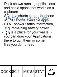
I did a little mock up, I am not really confident with it, but I think it is close to something I could very well live with, though it might look slightly old fashioned.
The image doesn't show how “application windows” would look like on this system: I imagine a single application handler, usually showing the application logo, which contains a menu regulating the windows size on double tap (to be able to show two (or more) applications at once)—next to this object we would have some space for menus.
If you want to close that application, just drag its handler into lower right corner. (I am sorry for not knowing the correct vocabulary concerning this, excuse me, please)
Some other features would be smart scrolling for “everything”, including the space on the right of the app handler, to make advanced applications possible.
And to make that plan totally unrealistic:
It should be toolkit-agnostic.